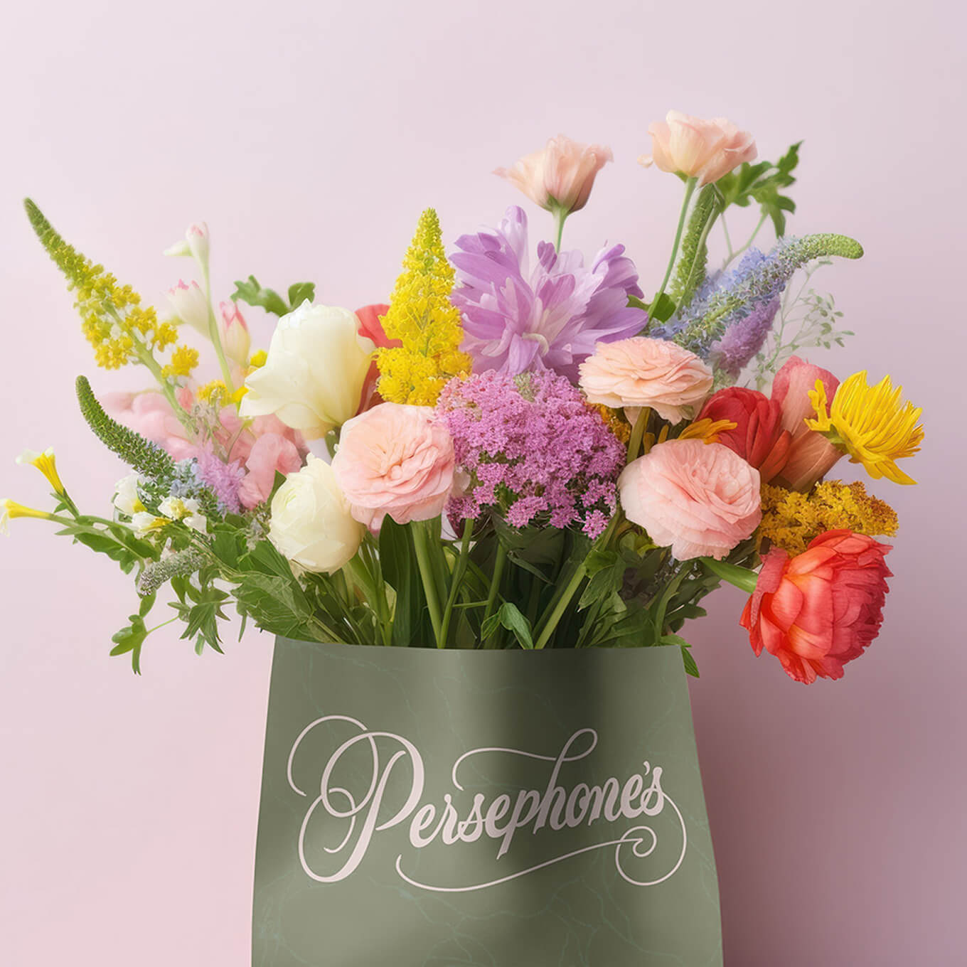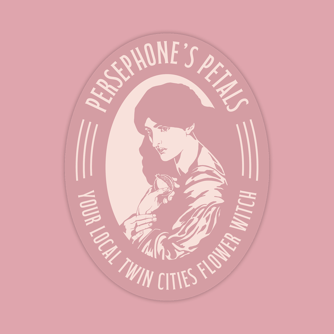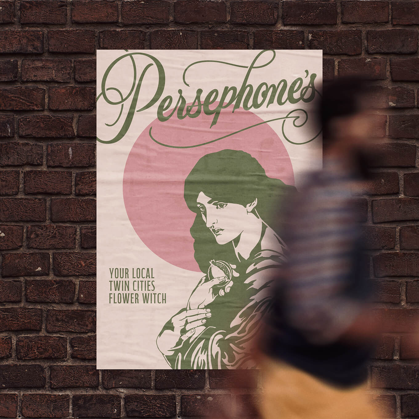
Persephone's Petals is a woman-owned floral shop based in St. Paul, MN. With a name drawn from the Greek goddess of spring and the underworld, the brand needed to carry the weight of that myth, remaining ethereal and elegant, but with something darker underneath. Persephone's story is one of beauty and darkness, growth and loss, and the identity had to hold all of that at once.
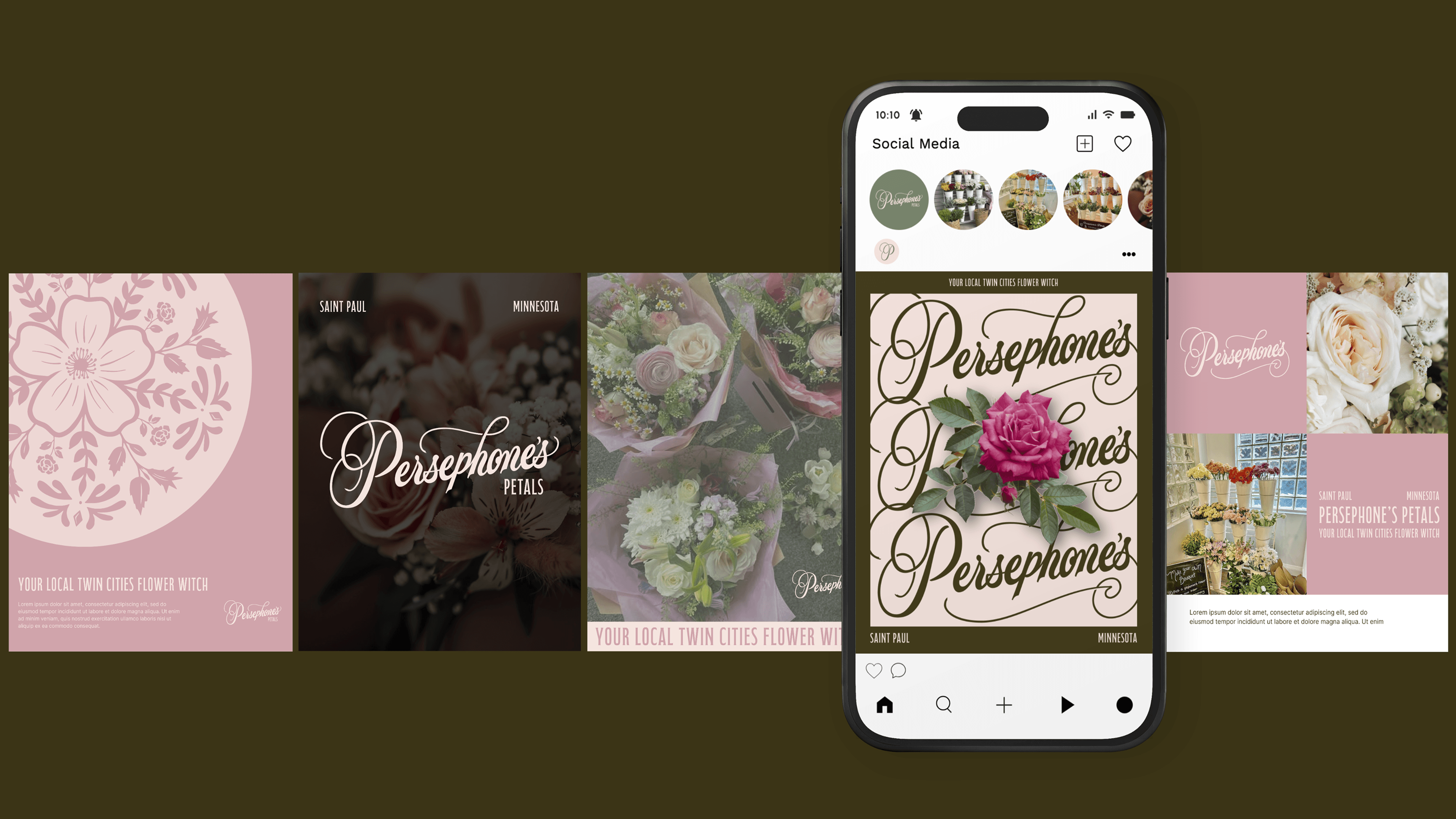
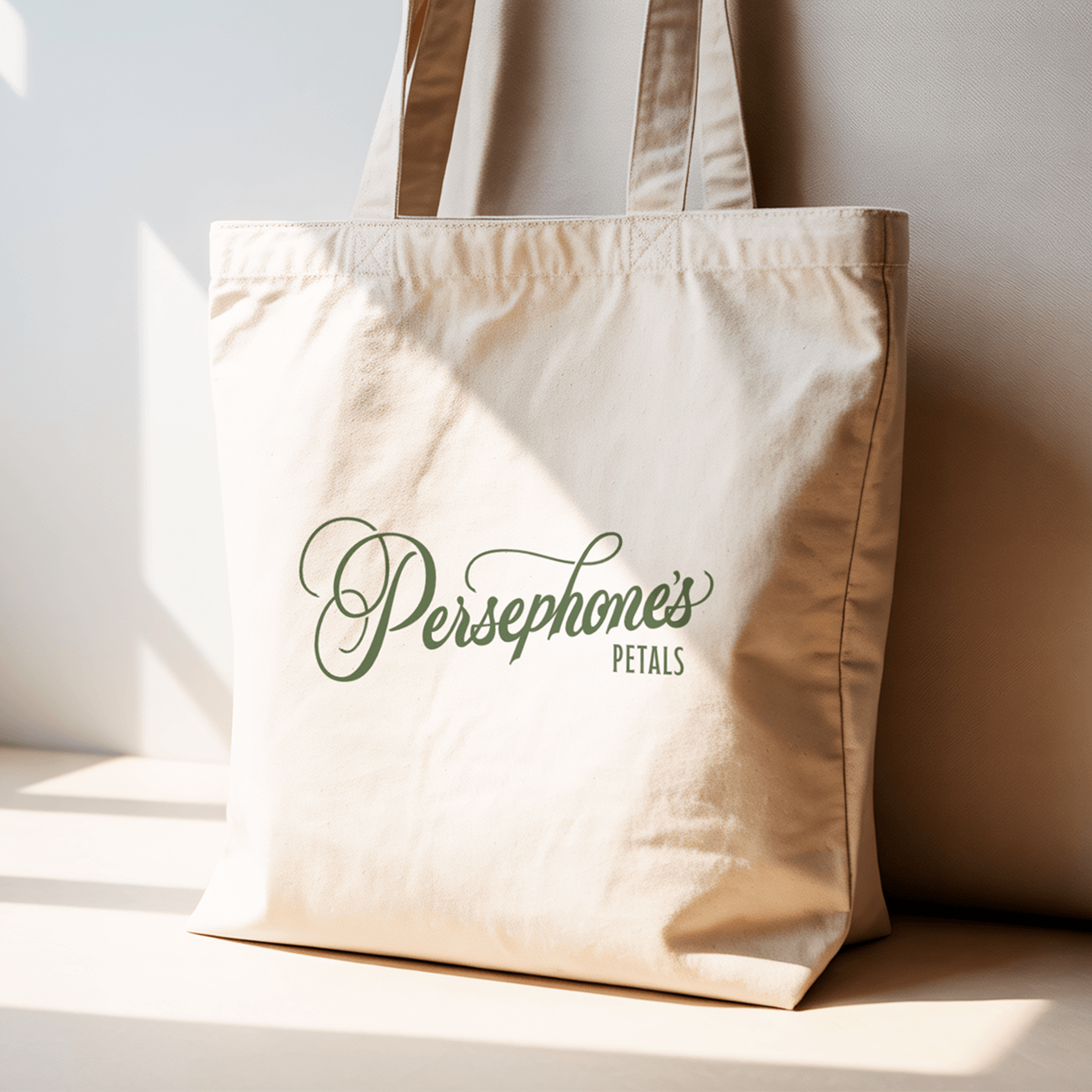
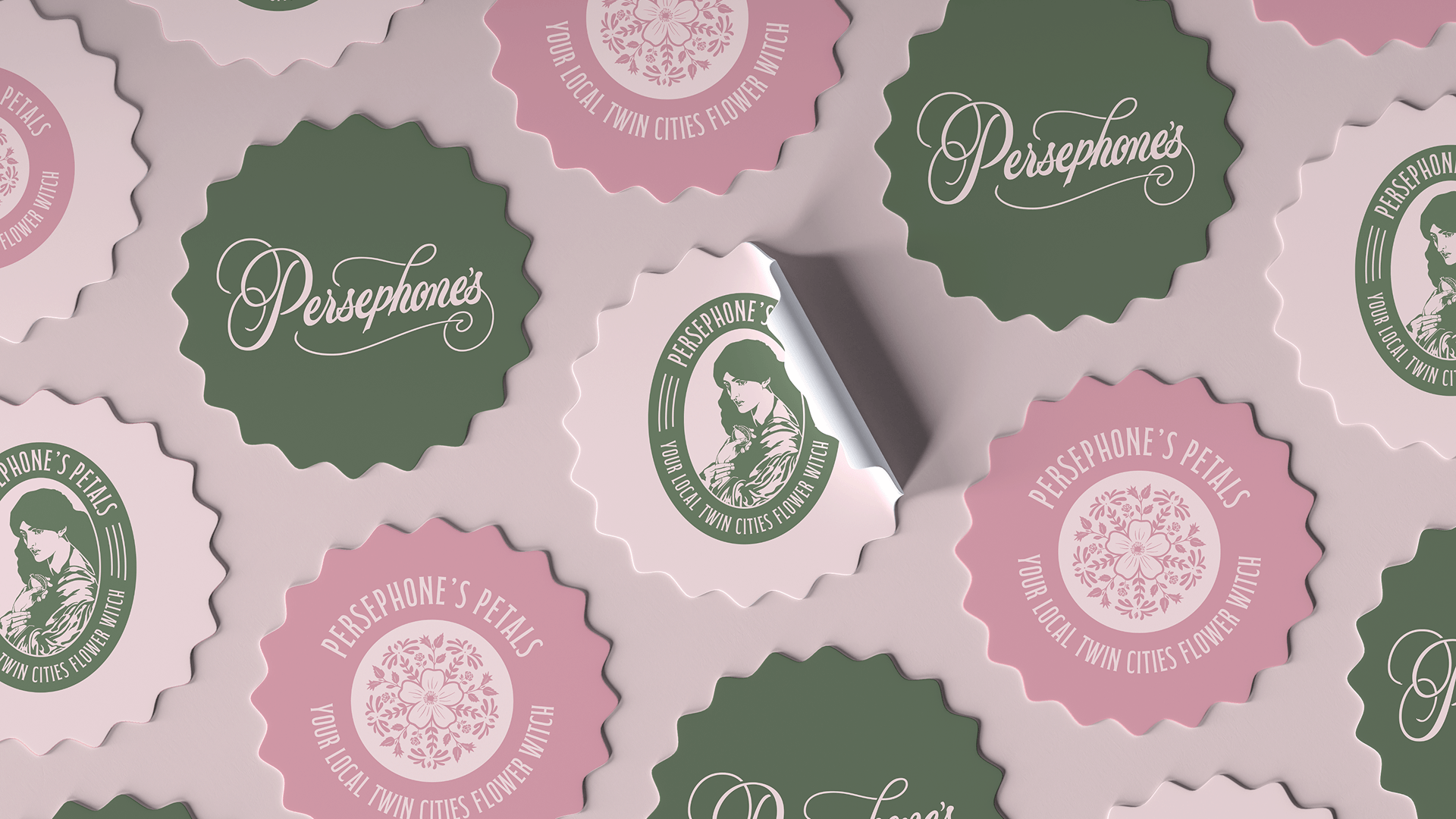
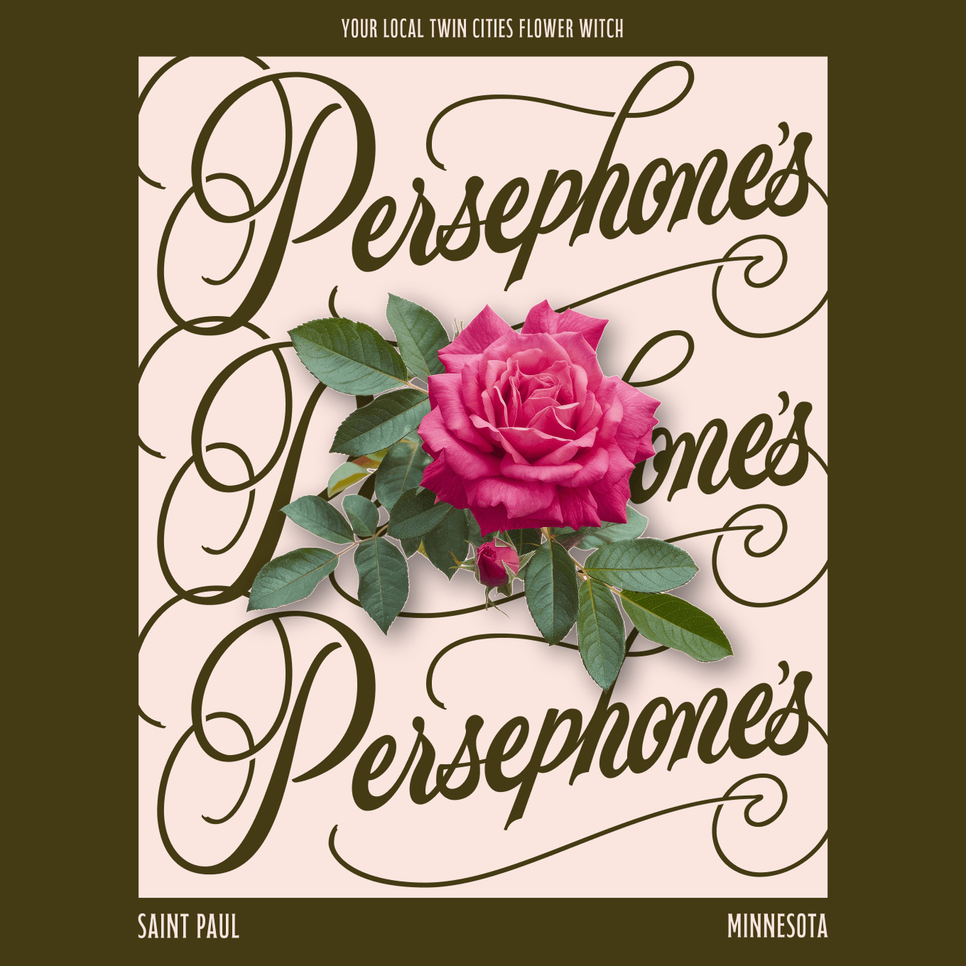
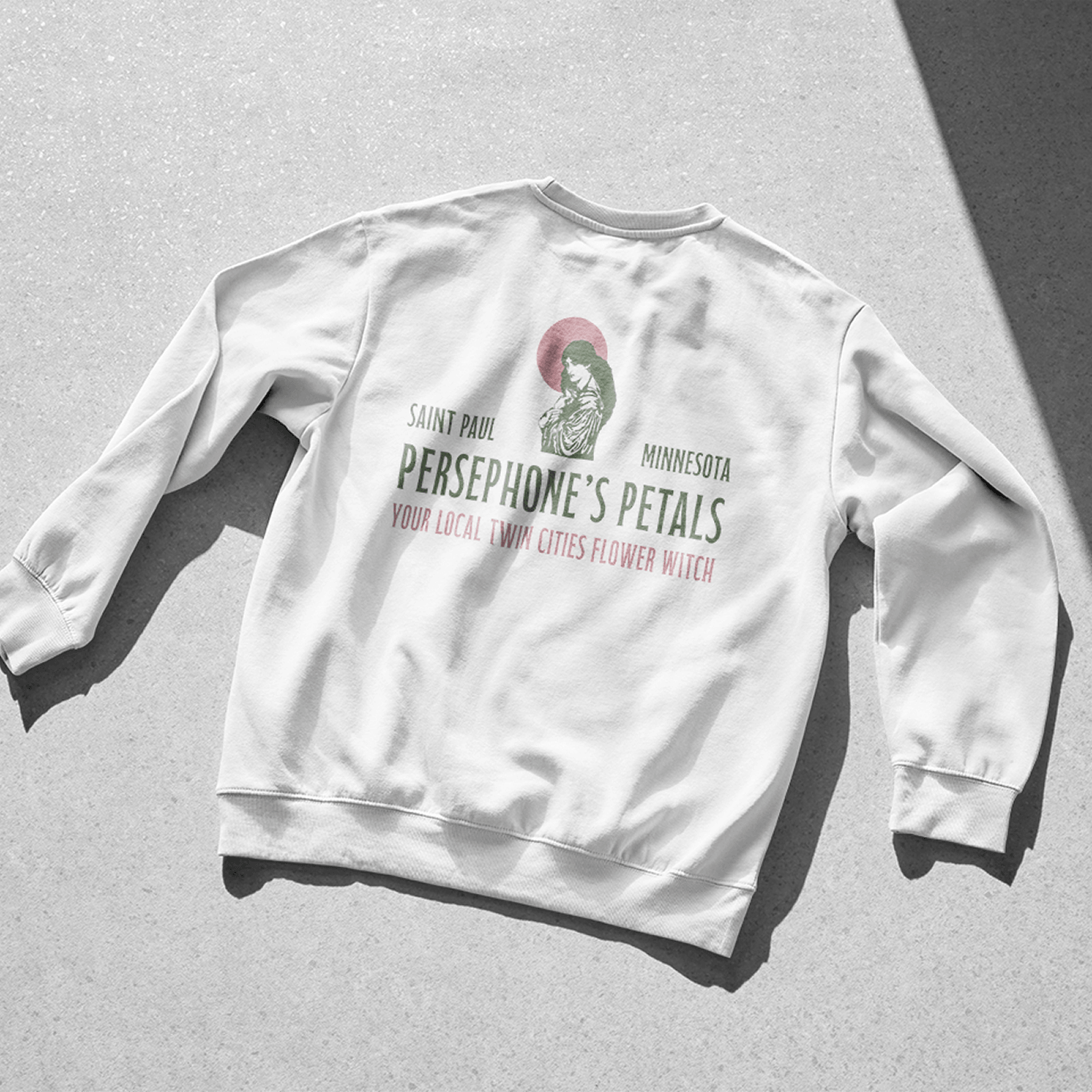
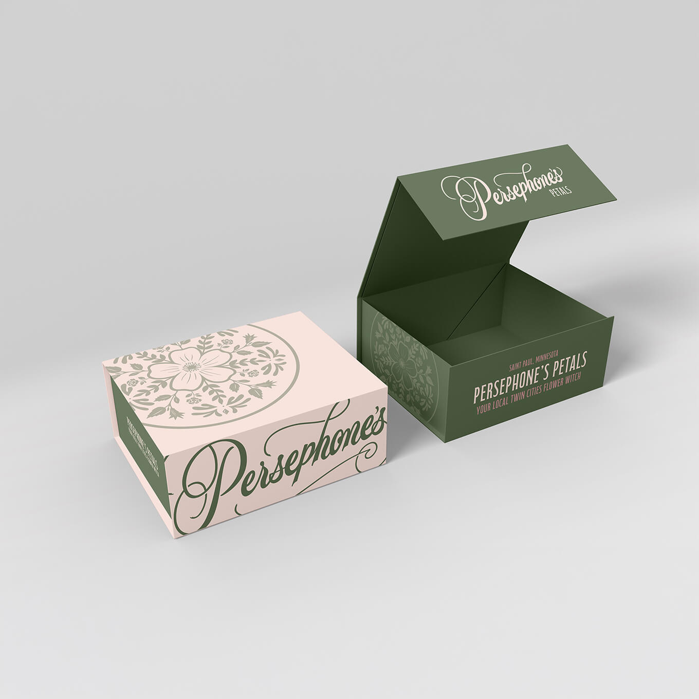
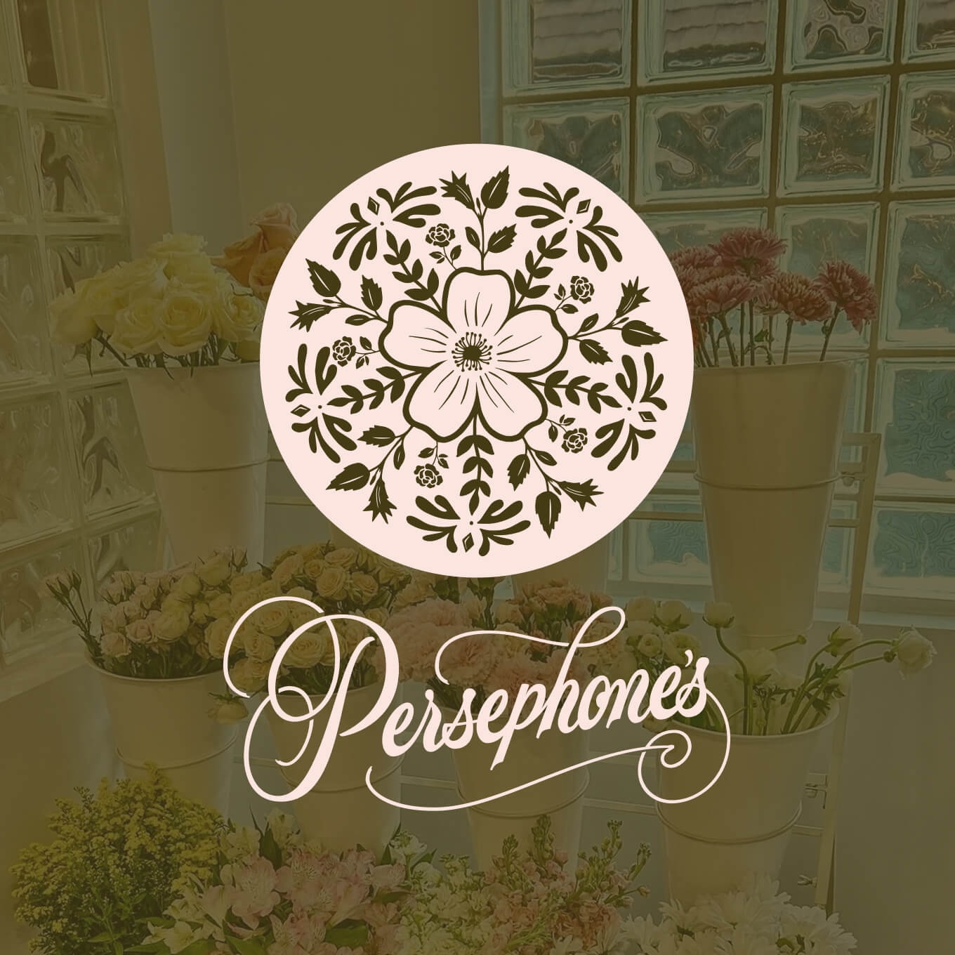
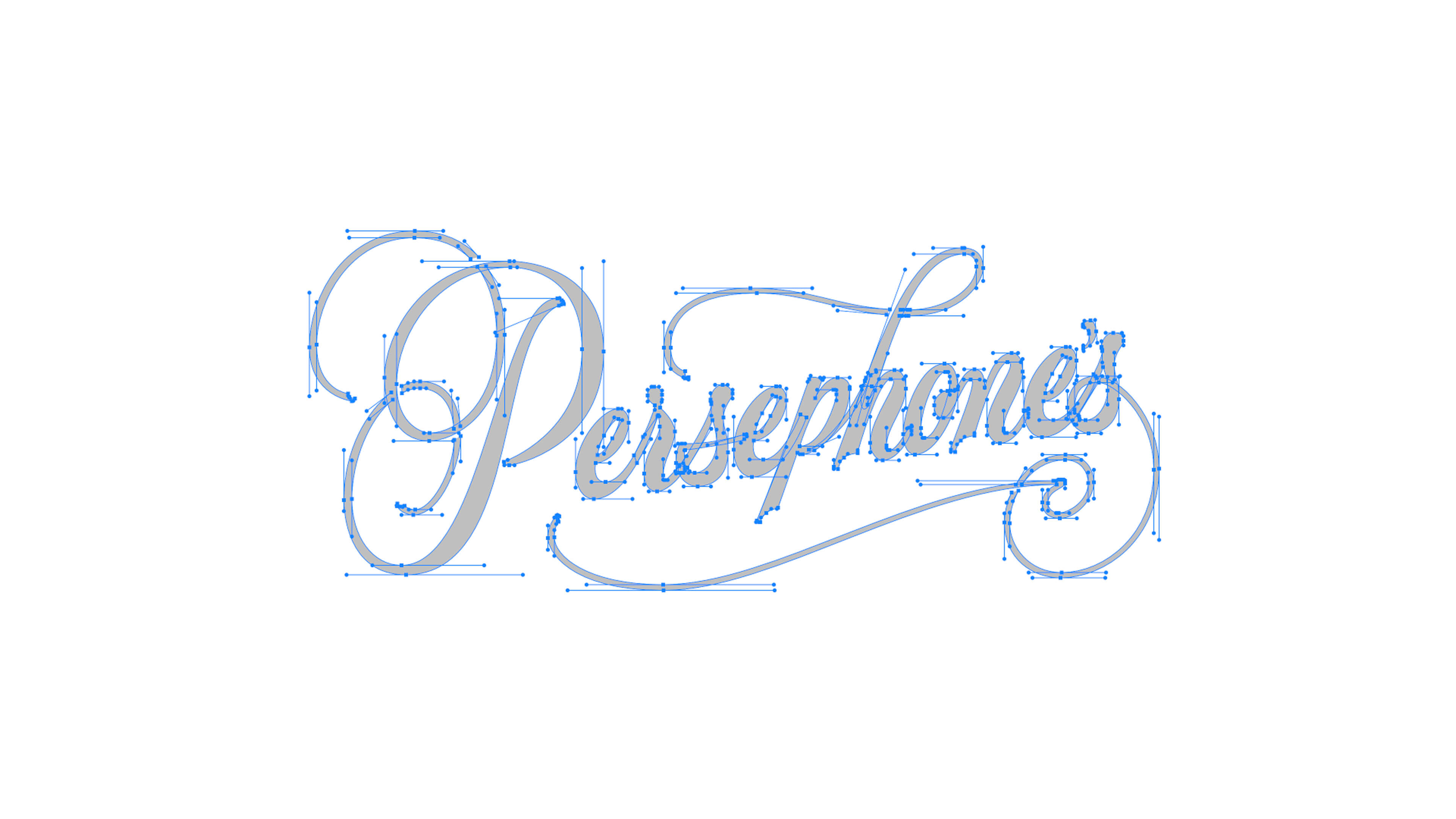
The color palette draws from the earth itself — the lush greens of the harvest and the deep, rich tones of the underworld — grounding the brand in the mythology it was built on. At the center is a custom hand-lettered primary mark, designed as a responsive system: one version features an elegant letter flourish blooming into a flower, while the alternate incorporates the full word "Petals" for contexts that call for more clarity. Badge designs and a signature floral pattern round out a visual identity that feels as timeless as the myth it's named after.